Overview
The Library of Congress is the largest library in the world, and the first one to start making their resources available online. It has holdings that currently include 21,000 digitized audio records and 8500 digitized videos, plus many more physical records yet to be digitized.
Project Goal
Through this capstone project, the LoC aims to enhance the way audio/video content is discovered on the loc.gov website and improve user engagement with their artifacts and collections.
Role
Researcher, Designer, Project Manager
Duration
Aug, 2019 - May, 2020 (~30 weeks)
Team
Aashrey Sharma, Christine Pisarczyk, Ghazaleh Keshavarz, Sharan Hegde
The Problem
Conversations with the client revealed that the library faces challenges in attracting users for audio-visual content. Most users who can access A/V content on library as a primary source seek library content through different websites (ex. using Getty for images originally existing on loc.gov).
In this aspect, the client wants the team to conduct user research to understand how users experience the current Library holdings; the contexts in which they are using the holdings interface; what challenges and opportunities exist to improve their experience when using the interface.
Finally they want design solutions guided by the user research to improve access to the holdings and make it more discoverable, accessible, relevant and useful.
Design Solution
After our comprehensive research phase and design iterations we came up with the final screens that build on the existing LOC website and introduce new additions that improve discoverability of media on the website.
Introducing Topic Detail Pages
Topic pages effectively consolidate and portray information on subjects like Civil War or Jazz Music that are spread across different collections on the LoC website. This allows in-depth exploration of these topics for users who are researching or learning about the topic for the first time.
Customizing Search Results
The existing search results list on LoC has little emphasis on relevancy or importance of results' order. It also lacks in aiding further search or exploration. We introduced changes like prioritizing content based on previous searches, suggesting alternative search keywords towards the end of the results list and introducing a related topics/collections section.
Incorporating Media Search
Since finding audio video content is a very visual process, restricting the search to just textual keywords inhibits the users abilities to discover in more creative ways. To solve this issue we introduced a media search that allows the user to search by uploading an image, audio or video file to find similar content on the LoC website.
Re-imagining Content Detail Pages
Being unable to get the gist of longform audio/video files quickly was a recurring concern amongst our interviewees. To tackle this challenge, we introduced an audio wave form that allows the user to seek the file easily and access it in shorter segments with intuitive labels. We also tweaked the layout and introduced additional blocks to discover relevant content.
Providing Content Comparison
There are often multiple pieces of interest to the user within the search results list. The new content comparison feature allows users to select items of interest in a basket and compare them on different metadata qualities seamlessly.
My Role
The capstone project was done in collaboration amongst a team of 5 designers and everyone played an intergral part of the team. My contributions to the project were as
- A researcher conducting interviews, facilitating data interpretation sessions and ideating product concepts
- A designer involved in creating storyboards, wireframes and high fidelity screens
- A project manager handling logistics of team and client meetings, documentation and task scheduling
Narrowing the target audience
Although the library aims to reach a global audience, for the scope of this project the team and clients decided to focus on a narrower target audience. We identified two different yet crucial groups to the library in terms of engagement and prior traffic statistics. These groups are:
Educators & Researchers
Areas of Interest: American History, Gender and Women's Studies, Post WWII, 20th century Art in Europe, Colonial Latin America
Creatives
Areas of Interest: Radio, Television, Film, Media and Library Studies, Art Installations, Digital Experiences, Technology and Social Justice, E-government
Gaining insight about media discovery
Analyzing the market
As part of our background research we conducted a literature review of 20 academic papers to understand and reveal novel approaches to audio visual search.
We also checked out products in the market that are pioneers in audio visual search like Spotify, Youtube, Twitch etc to extract useful interface elements and interactions.
Finally we conducted 4 Subject matter Expert (SME) Interviews to get an in-depth understanding of the conventions of storing longform media and how digital curation is done on large digital libraries.
The insights from background were consolidated into user stories that would further drive our ideation in the design phase:
Long A/V content split up into Chapters
Maya is deciding which parts of a video she wants to watch. She can view a video’s chapters which segment the video into smaller chunks so she can determine if the video covers any relevant topics to her interests. She finds a relevant chapter and the video marker skips to that time.

Most Watched Segments of A/V Content
Carol wants to write an essay on contemporary views about the civil war. She searches for “contemporary views about civil war” on Google and find a link to a video. The video player tells which parts of the video are most watched, which indicates what parts are popular or generate the most debate, so she watches these parts of the video.
Understanding the user
The background research helped us identify the right direction of conversation with the users in 8 one-hour long contextual inquiries. The focus was on:
Understanding how users discover media relevant to them and their domain.
Learning about the participant’s needs and frustrations while searching for A/V content.
An affinity analysis of about 400 notes from these interviews revealed several user behaviors and patterns with respect to finding a/v content relevant to them. Some of the more prominent ones are:
01
It’s important to offer ways for a user to quickly capture the gist of media
02
Users primarily make use of small portions of longform media
03
Creatives tend to search based on hard-to-define qualities such as emotion
04
History professors shared media with students and creatives remixed it for their multimedia projects


The research phase ended with a wall walk that allowed us to immerse ourselves into the research data. A visioning session gave direction to that data and the outcome was a skeleton of product features that we could develop on further in the design phase.
Brainstorming design ideas
Putting pen to paper
With our heads full of insights about the user — their needs & behaviors — and state-of-the-art in this domain, the team began ideating the features that we can draw into the LoC website. For this purpose we chose story boarding as a starting point to our design phase.


The storyboards helped us ground our ideas to the users’ context and made it easy to generate a product structure out of the different features we had thrown around in the ideation sessions.
Introducing structure
Once we had our complete story boards for the different ideas we had generated, we created wireflows ↗ of the same to better communicate the ideas to the client while ensuring that there was no step missing from the flow derived in the storyboard scenarios. An expert review of the above deliverables gave us useful feedback which we incorporated into our storyboards and respective wireflows.
We then began identifying what piece of function belongs where on the LoC website. The end result being the comprehensive user environment diagram (UED). The UED is a comprehensive map of the product which specifies where each feature lives on the product, the connections between the different features and all the actions the users can take within the scope of that feature.

Refining the design based on feedback
The wireframes and low fidelity screens were tested twice with 5 users each time. Usability tests were conducted with specified tasks and scenarios to get targeted feedback on interactions and layout. Any other comments from the user during their think-aloud walk through of the prototype were also noted down.
Below is a sample of how some feedback points on the low fidelity got incorporated into the final design.


Painpoint: Interaction for comparison through the toggle button is unclear
Change: Incorporated comparison checkbox to each search result
Painpoint: Different icons aren't intuituve. Seem actionable but are not!
Change: Removed all the various icons conveying different metadata, retained artifact views at the top of the card
Creating the final designs
Bringing in the LoC style
Since the LoC already has an established brand guide, we pulled the primary aspects of our style guide from there. For any new elements we introduced, we tried keeping the style as true to LoC brand as possible.

Once we had the groundwork for the style guide, we rapidly moved our lo-fis into high fidelity designs.
Diving into the designs
01 Topic Detail Page
Our idea of a "Topic" page is a place where everything related to particular subject resides under on that single page. One of the key functions of the page is effectively summarizing the subject using a curated slideshow of "events" that describe that subject. For ex. World War II would be considered its own topic and the slideshow would capture the major events and info. about this period.
It also consolidates all the resources relevant to this subject spread across the website and demarcates between the types of resources intuitively - highlighting content for educators and experts who frequent the website for specific content.


One of the challenges while designing the topics pages - brought up by our stakeholders - was the technical challenge in curating this page. The vast number of resources on the LoC make it hard to manually curate the page from scratch. The work around suggested by the team was to use the solid metadata framework the LoC has to extract tags relevant to each topic and collect data into intutive segments. However, there would still be need for human intervention to smooth things out at the UI level.
Another challenge was to determine the structure, flow and interactions of the slideshow. We had to show effective segmentation of content in order to ensure the user doesn’t get overwhelmed with the sheer volume of content. We incorporated some micro-interactions to seamless showcase the parent-child relationship within the slideshow
02 Media Search
We introduced a new "visual" way of searching by allowing users to upload files, paste links or take photos to search for content on the LoC. The search results will be generated by analysing the metadata and other discernible qualities of the uploaded media.
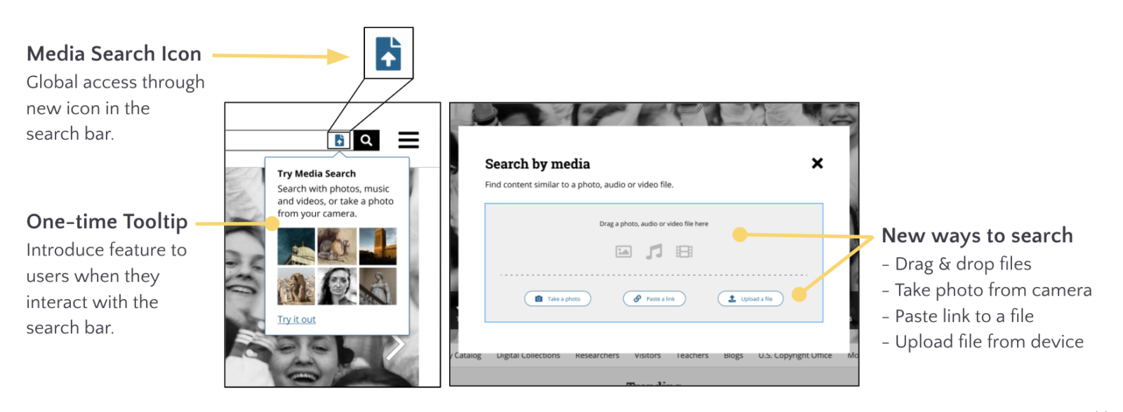
The media search evolved from the low fidelity by including an option to "Take-a-photo" which effectively captures the context of the user while searching for media.
The idea came out of an interesting conversation during one of our user tests where the user mentioned how they would like an option to click a picture of something on the go to look for more information about it in the LoC. We came up with a mobile interaction depicting this feature effectively.
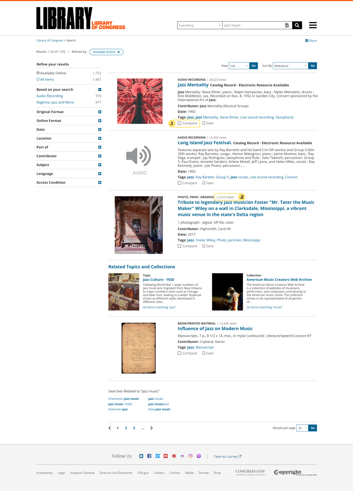
03 Search Results
We have tweaked the original LoC search results page to enhance the current experience and shift the focus to further discovery by introducing features like recommended filters, suggested keywords, related topics and even comparison of results.
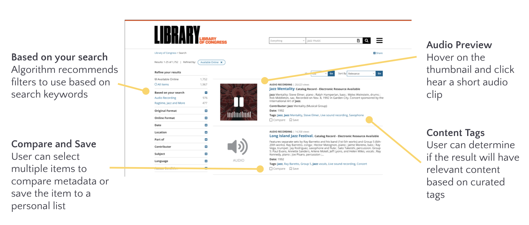

The dynamic thumbnail feature captures the most played part of an audio/video as a preview of the entire file. This was iterated during the lo-fi feedback loop where initially each search result card had the entire audio waveform in a collapsed format.
There were several conversations regarding the hierarchy and layout before we arrived at this minimal yet effective design which captures all the important aspects for getting the quick gist of a search result and has enough emphasis on refining the search if the user does not find something of interest.
04 Content Detail Page
We have also revised how the page for each individual artifact on the website looks like. We introduced the audio waveforms for an additional visual understanding of audio qualities to get an overview of the tone and intensity of the audio. We also tweaked the layout and hierarchy to make it more easily digestible to the user.
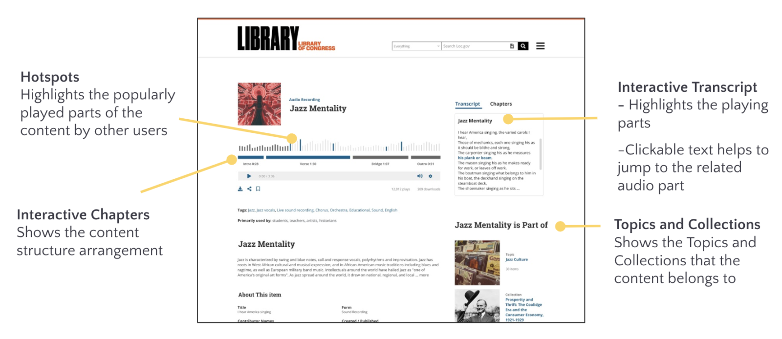
The audio waveform is segmented into chapters which are accessible in a tab next to the interactive transcipt. The waveform, transcript and chapters work in tandem to make the content more easily and quickly understandable to the user. Below is a showcase of how the interactions work between the three elements.
Final Feedback & Wrap-up
We did one final round of usability testing with our users which mostly had positive results. We had the participants fill out a User Experience Questionnaire (UEQ), where the results were favourable in terms of Attractiveness, Dependability and Efficiency.
We wrapped up the year long capstone project with a final zoom call with about 20 people from the Library of Congress sitting in. It was an exhilirating experience conveying our final screens to the audience and it was re-assuring hearing how aspects of it were immensely relevant to the different stakeholders in the meeting. Waiting eagerly on seeing some of our work reflected on the loc.gov website!

The amazing team (minus Aashrey who unfortunately missed out on this amazing photoshoot)
Get in touch
Email: mahitha.design@gmail.com
LinkedIn: mahithakalyani
Medium: @mahitha13
© Mahitha Kalyani 2022