Overview
Skincare is receiving a lot of traction in recent years and there is a huge emphasis on engaging in good skincare routines. Despite the prevalence of challenges in the domain of skincare & skincare tracking, there is a scarcity of solutions to address the concerns of the concerned population online.
The goal of our project is to gain insights into challenges w.r.t. skincare as well as skincare tracking to propose an effective mobile tracking app that addresses some of the crucial pain-points.
Role
Lead Designer, Researcher
Duration
Sep, 2018 - Dec, 2018 (10 weeks)
Team
Hana Hailu, Parth Boricha, Rashmi Sankepally
The Problem
Skincare issues are a very common concern nowadays. I myself face several challenges with skincare and speaking to some colleagues revealed that there is struggle in maintaining motivation to carry out skincare routines overtime - especially since the results of these skincare routines take time to show.
The team then decided to analyse the solutions in the market that address these skincare challenges and a quick search of the AppStore revealed that there is lack of good skincare tracking apps with the existing ones being very poorly reviewed.
Thus began our quest to identify the challenges in the skincare domain and see how we can best assist them.
My Role
This project was done in collaboration with people from a non-design background venturing into design. So, I took up the role of lead researcher and designer for this project. My key functions as the lead involved guiding the research and design processes by choosing appropriate research methods, creating the style guide and facilitating work distribution. Apart from this role, I was involved in each step of both research and design phase along with the rest of the team.
The Process

Research Phase
Design Phase
App Review
As part of the background research, we analyzed 7 of the most reviewed apps on the AppStore/PlayStore on some relevant parameters creating a comparison matrix. We also identified a list of limitations which could give us potential relevant app specs for DermaTrack.
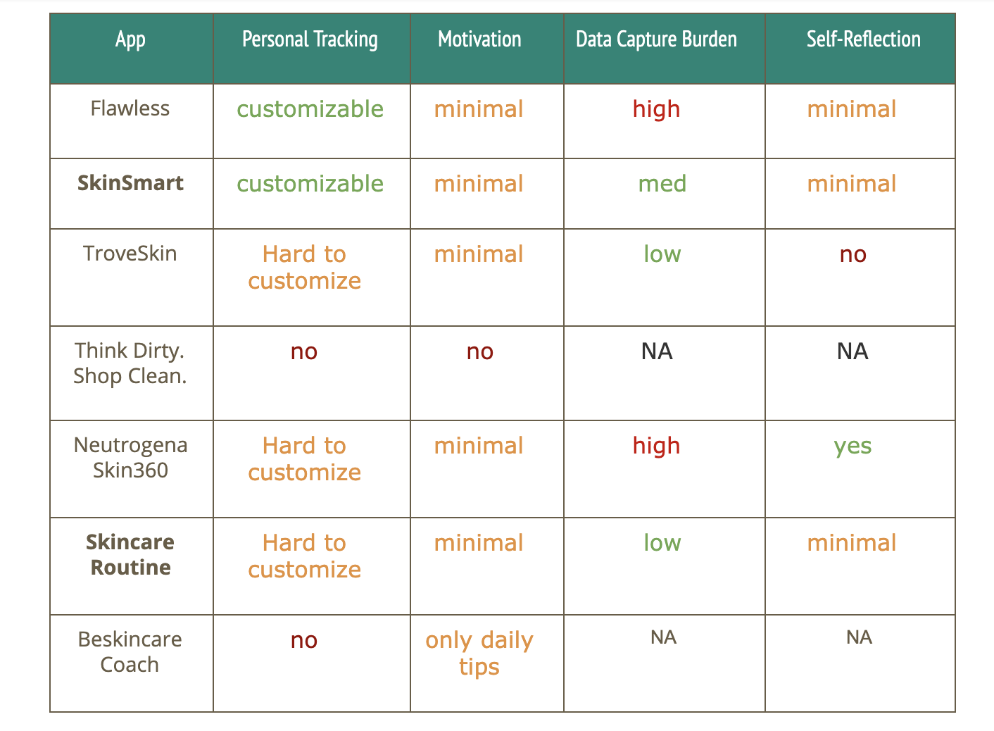
Limitations
- No visualization of skin care routine tracking
- No correlation analysis of skin care condition in relation to skin care routine
- Less opportunity for self-reflection and feedback
Potential App Specifications
- Allow skincare routine tracking alongside skin condition tracking
- Incorporate reminders and prompts for data capture
- Introduce gamification and visualizations to increase motivation to use the app
Semi-structured User Interviews
Semi-structured interviews ere conducted with 7 female participants. The interviews followed structure set by the interview guide.
Key highlights from the interviews:
- Participants rely on memory-based routine tracking for their skin
- Participants had specific end-goals in mind while following certain routines
- Lack of motivation was a prominent pain-point while following daily routines
- Collective tracking method such that some other person acted as a skincare coach or mentor was observed
- There was a growing interest in usage of natural-ingredient based products
Affinity Analysis
We gathered all the interview notes and arranged them under topics and themes in the form of an affinity diagram.

Based on the themes that emerged we created a board of pain point identified and corresponding ideas that we could incorporate into the app.


Setting a focus
Towards the end of our research we identified four focus areas out of our collective data analysis that we would target during the design phase.
Enabling
Ease of Data Entry
Assisting
Goal Setting
Increasing
Motivation
Prompting
Self-reflection
Sketching
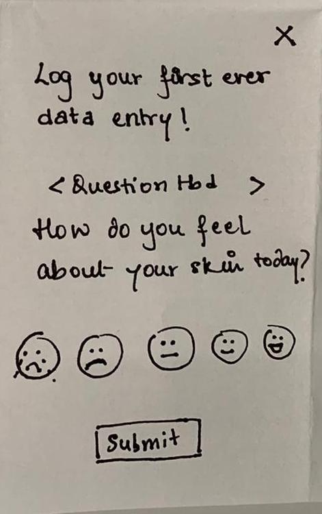
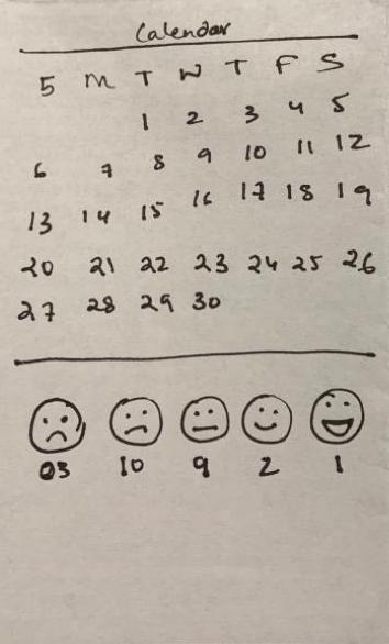
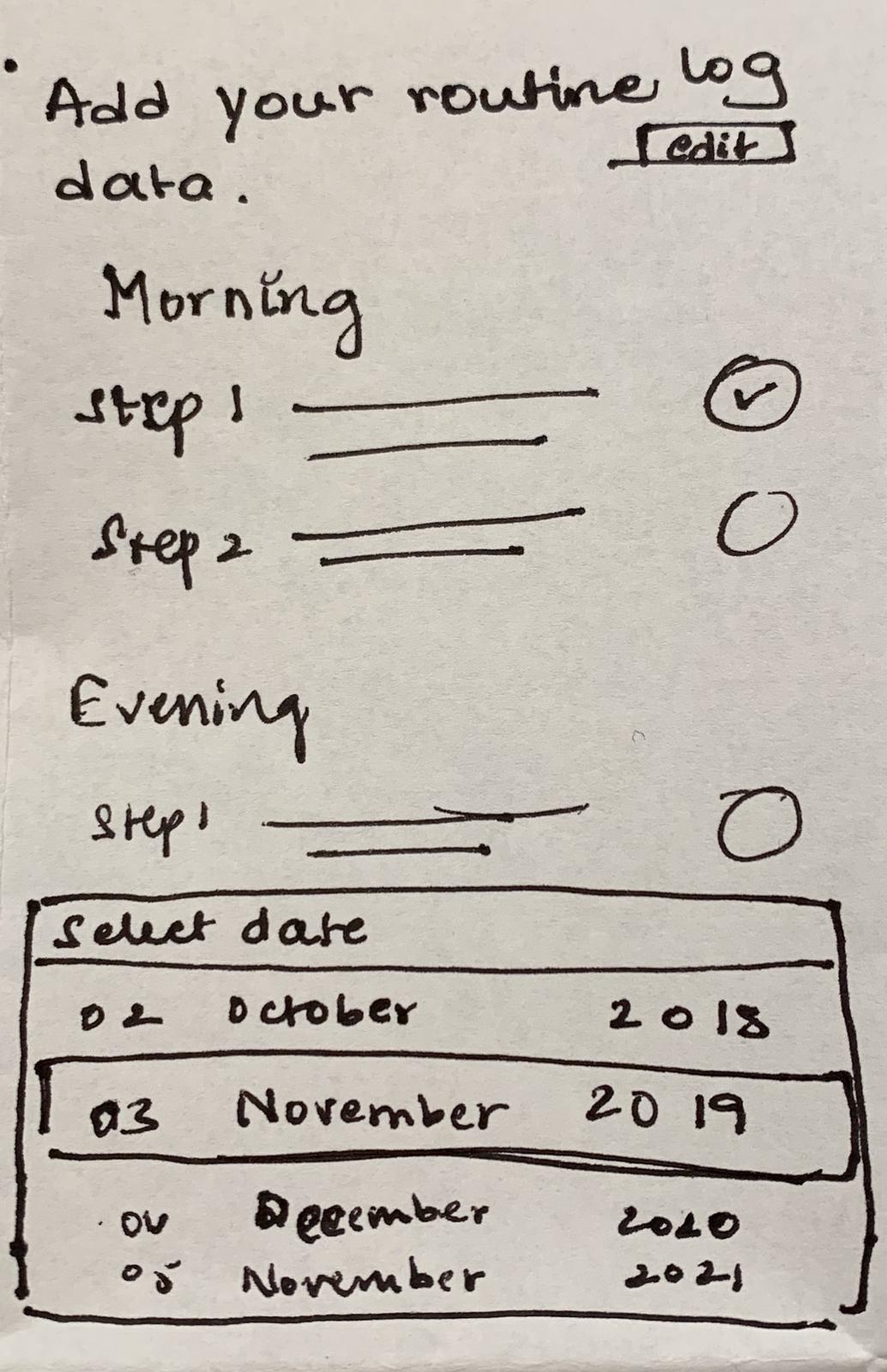
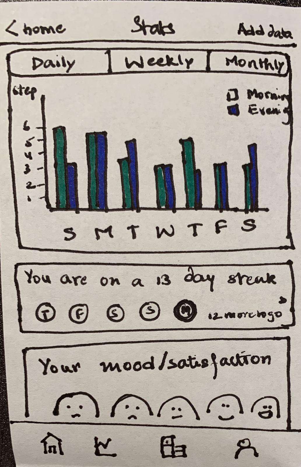
To begin ideating on the ideas we derived from the data, we carried out a sketching session with the entire team. During our session, we conducted the crazy 8's activity where we sketched 8 sketches of different features for 8 minutes.
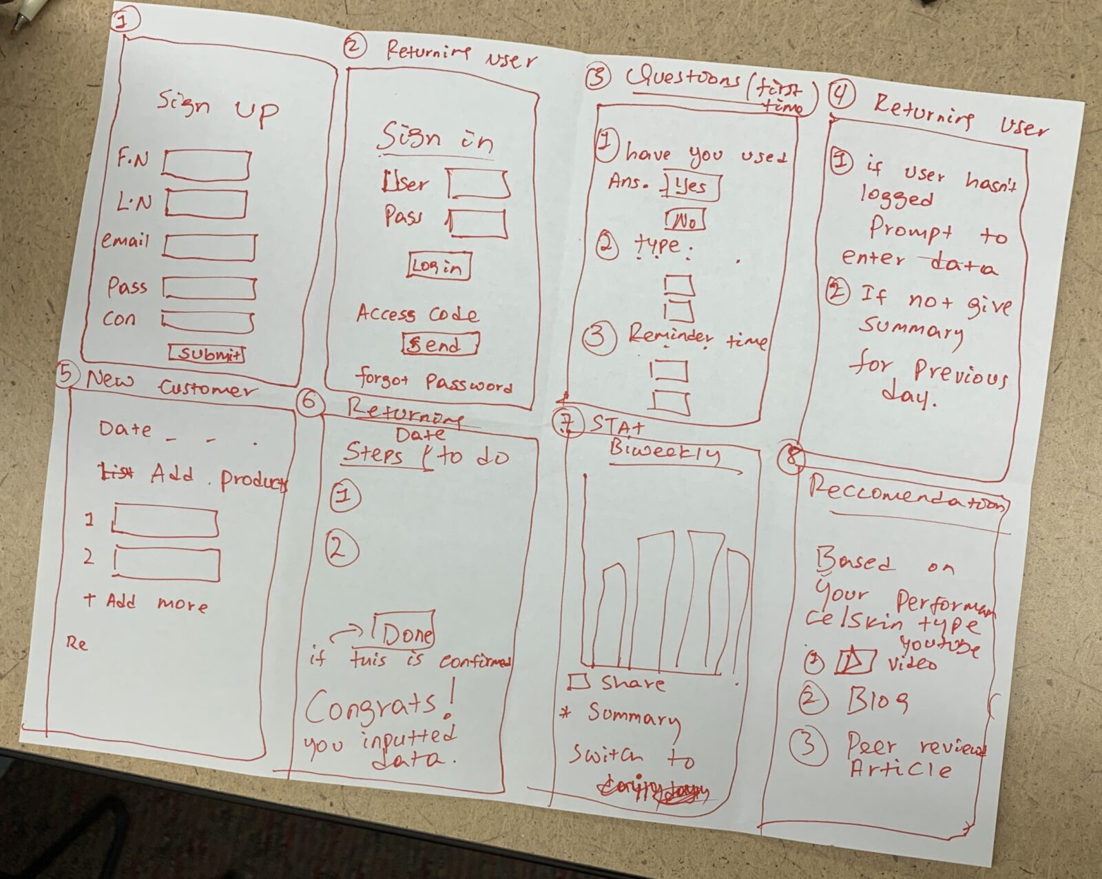

After a round of sketching, we explained our design to the team and did +s, -s & DIs and shortlisted a set of ideas we wanted to incorporate into the MVP of the product.


Wireframes
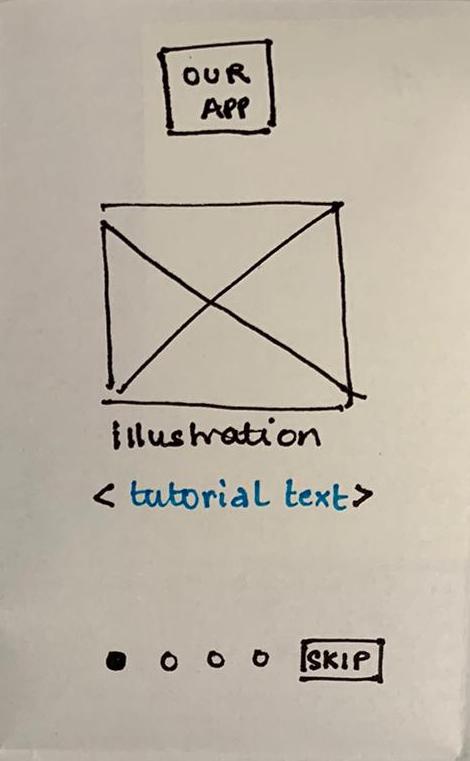
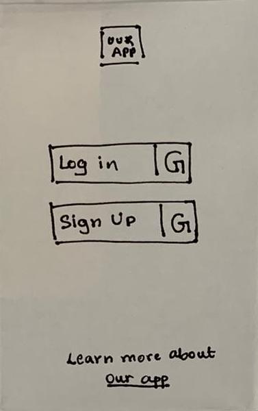
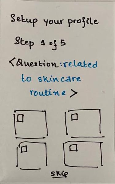
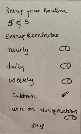
The sketches were then detailed out into complete wireframes which had an intuitive user flow and highlighted the key features in a thorough manner.
The first iteration of wireframes was tested with three of our original interviewees. We identified gaps in the user flow and the need for more detailed screens to outline each step of the process. After adjusting the wireframes based on the feedback we moved on to high fidelity design.
Design System
To manage design elements across the team we came up with a design system on figma - a collaborative design tool. The product name DermaTrack was derived keeping in mind our project focus with was skincare tracking. The typography and icons were all selected such that they are engaging and personal.

Final Design
The final design tackles the problem of users lacking motivation to follow complex skincare routines because of late visible results. The design targets the four focal points identified at the end of the research phase.
Assisting
Goal Setting
The research suggested that users often had a goal in mind while practicing a skincare routine. These could be long term goals like clear skin or shorter goals like dark spot reduction. The app allows users to set up goal-based routines easily in an engaging on-boarding process.
Enabling
Ease of Data Entry
Ease of Data Entry was ensured by allowing users to track data with simple logging actions. Once the users have set up a routine on the DermaTrack app, they can easily log data by selecting the radio buttons corresponding to the steps they completed daily.
Increasing
Motivation
The app provides users with a "tracking buddy" who accompanies the user on their tracking journey. The tracking buddy has several states of emotion ranging from happy to dissatisfied. Based on the frequency of times the user logs data, the companion's mood will be influenced. The user will be motivated to keep their companion happy and engage in logging more often.
Prompting
Self-reflection
Another way the app allows users to remain motivated in their skincare process is by allowing them to see their progress through engaging visualizations and earning badges on completing certain tracking milestones.
A peek into the design process
Take-aways
This project was a challenging and learning experience for me. The leadership role put a lot of pressure in terms of defining the process and finding the right kind of balance between the team while distributing work.
Having to scope the design from the vast list of ideas to a cohesive MVP was challenging and I feel more work is needed in that area of identifying what is crucial and what is not.
Credits: Process icons Created by Anthony Ledoux and DailyPM from Noun Project
Get in touch
Email: mahitha.design@gmail.com
LinkedIn: mahithakalyani
Medium: @mahitha13
© Mahitha Kalyani 2022

